
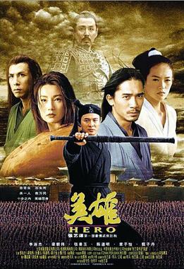
Hero is a 2002 Wuxia film directed by Zhang YiMou. The film featured Jet Li, Donnie Yen, Tony Leung, Maggie Cheung, and Zhang Ziyi. First off, I knew I had to watch this movie because these big names. Also, I love watching martial arts films because it is always exciting to see the fights, style of martial arts and weapons that the characters use.
One particular aspect of the movie that everyone will notice other than the stunning fight scenes and austere conversations between characters, are the stunning visuals and use of colours.
It might seem that Director Zhang used different colours to represent particular meanings, however, during an interview (IndieWire magazine), he mentioned that there was no particular meaning to each colour. These colours were used to represent different story lines within the movie.
Personally, I felt that the colours used can be interpreted into certain emotions and meanings. There are five main colours used, throughout the scenes which are Black, Red, Blue, Green and White.
So what could these colours possibly represent?
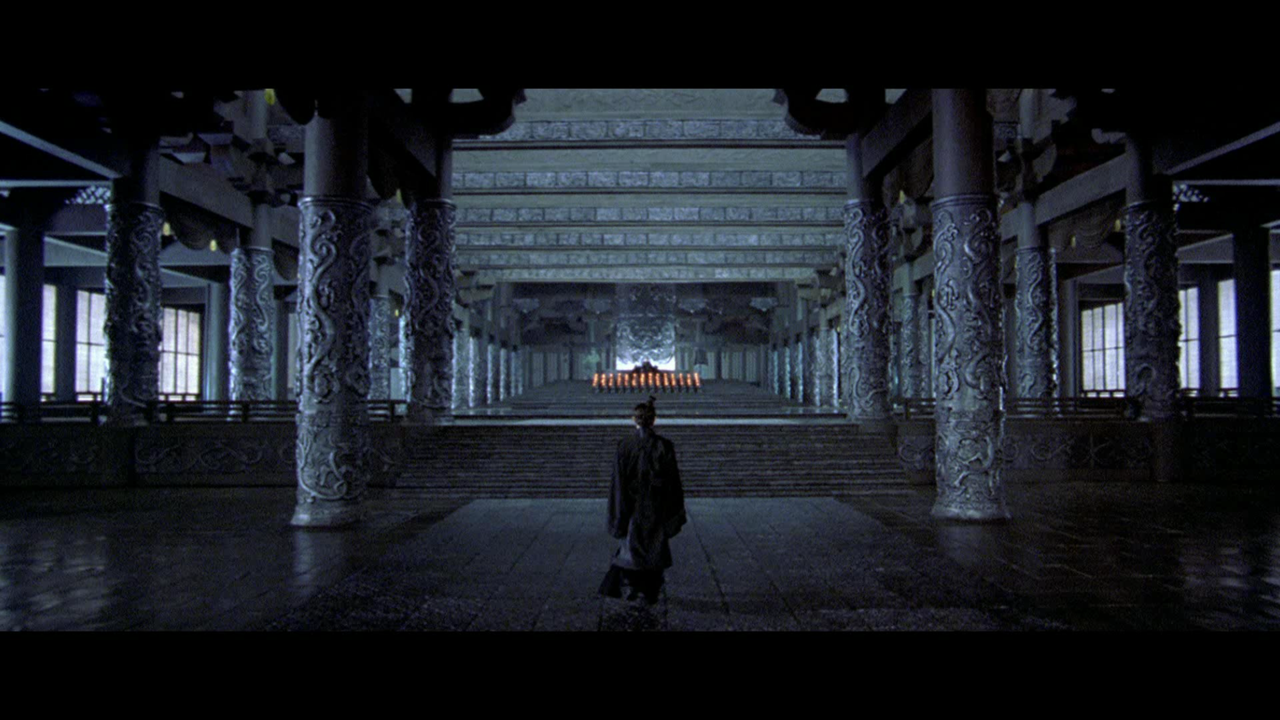
The first scene which took place at the King of Qin’s palace was mostly in Black and Grey. We were also introduced to Nameless in this scene. Throughout the film, Black was associated with King Qin, his army and Nameless. Scenes such as Qin’s army firing a volley of arrows and Nameless being stronger than the rest of the assassins is why I felt that Black in the film represented Power.

The second colour was Red. The scene took place at the Zhao school where students continued which their calligraphy even though they were attacked by the Qin army. We were also introduced to Broken Sword and Flying Snow. Snow killed Sword which also resulted in Moon (Sword’s apprentice) to fight Snow at the end of the scene. I feel that Passion and Anger could be expressed by Red here.


Thirdly, the scene where Nameless showcased his skills to Broken Sword and Flying Snow was represented with Blue. There was also a fight scene at the end, between Nameless and Sword which took place on a serene lake where Snow was laid to rest. I felt that Blue in this scene could stand for Tranquility. Another example was when Nameless cut the scrolls and everything fell but no one reacted or moved.

Fourthly, Green. I felt that Harmony was represented here when Broken Sword told Nameless about the time he met Flying Snow and the times they spent together. Later on in the scene, Sword fought King Qin and decided not to kill him because of how Qin could eventually create one harmonious country.

Last of all, the colour White. In this scene, Snow demanded Sword to fight her which ended up with Snow killing Sword and taking her own life. I felt that the colour White in this instance was a representation of Death.
To conclude, I think that using colours to represent different scenes and versions of stories from the characters made everything better and easier to understand.
On the other hand it could also help capture the attention of audiences better.
Overall, I enjoyed the movie and would definitely watch it again!

Wow, the different colours that represented the different scenes that were featured above were something that I could envision and feel that it was the colours that expressed the mood and setting that they wanted the audience to experience. Especially with the colours red and blue; the warmth of the colours red and orange and the cool from blue. I thought that apart from white representing death, I felt that it could’ve also represented peace or even closure – the end of something. I don’t know, what do you think? This movie has a couple of actors that I enjoy seeing on the big screen, maybe one of the days I’ll watch the film.
LikeLike
I think everyone has a general consensus on the use of colours in this film, and boy did Director Zhang truly use them to their absolute peak. With the stunning landscapes and intricate sets, costumes and props, each color and section was brought out to their utmost potential in best depicting the emotions and messages. I agree that it definitely captured the attention of the audiences, and made sure no one got lost along the way. In a way, it is kind of like a traffic light, guiding the minds and hearts of the audiences to where the Director wants them to go.
LikeLike